In Major Issues, we look at one newly-released comic book each week. Now updated Mondays.
Gardner Mounce
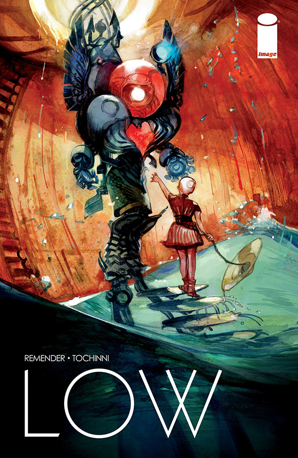
Low #1
Written by Rick Remender
Art by Greg Tocchini
Published by Image Comics
Publication Date: 7/30/14
Louis C.K. has a great joke about telling his daughter that in millions of years, once she and everyone she knows is dead, the sun will explode and kill everyone on earth. There’s not much of a punchline other than the fact itself, and finding it funny might be the litmus test for whether or not you’d enjoy Rick Remender’s latest series Low, a story about humanity’s last ditch effort to escape an expanding sun by living in cities beneath the ocean surface. Remender–always the pessimist–says it’s a story about optimism. We’ll see.
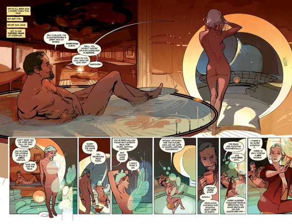
Unlike Remender’s other currently-running series, Black Science, a no-holds-barred sci-fi story that is supposedly written without a plan, Low promises something more classic and structured. There’s a clearly defined ticking clock (the sun is expanding) and even some mustache-twirling bad guys. We meet Johl, his wife Stel, and their two children. They are descendants of the Caine family, a founding family of the underwater cities. In this issue, Johl and Stel take their two children out of the city for the first time and run into trouble with underwater savages.
Remender paces the first issue well, but flounders with the exposition. He mostly avoids his trademark pessimistic narration, and opts instead to stuff his characters with exposition-heavy dialogue. In the first scene, Johl and Stel have one very stilted post-coitus conversation about plot points. But thanks to artist Greg Tocchini’s ability to draw realistic body language, we pick up that the two are very much in love. They just don’t have a lot to talk about besides exposition.
As for the art, Tocchini creates a visual vocabulary out of Low’s underwater aesthetic, especially in his use of spheres and circles. Not only are some of the panels themselves circular, but so are many aspects of the city’s architecture, and much of the technology is spherically designed. The spheres suggest air bubbles rising from oxygen tanks, the glass bubble that encases the city, the sun and the earth, and serves to indicate how fragile spherical things are in general.
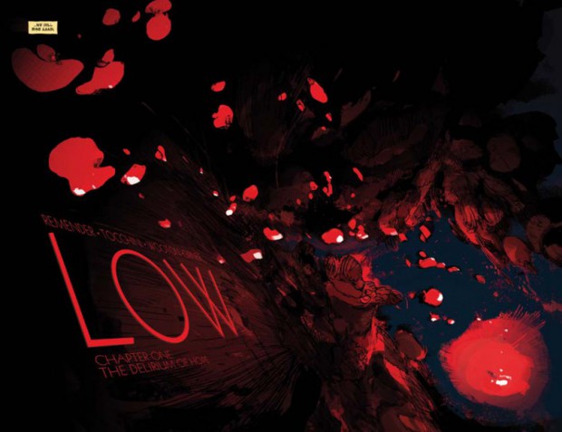
Even better is Tocchini’s way of suggesting the central conflict with the color palette. The two-page title page separates the world into burning red and absolute black–the polarizing forces of the burning sun above and the crushing ocean depths below.
Between these two extremes is where our characters live, in warm amber and deep jade–suggesting human warmth and the more habitable ocean depths, but also suggesting how sandwiched our protagonists are between destruction above and oblivion below.
Like most of Remender’s comics, I’m more excited by the art than the writing. Even in a comic about earth’s inevitable destruction, Remender’s writing comes off as heavy-handed. However, as long as he keeps pairing himself with artists like Tocchini who can add nuance and layers of meaning, I’ll keep coming back for more.
Should You Get It?
You could probably wait until the trade paperback of the first story arc. If you’re new to Rick Remender, I’d skip this and check out his series Deadly Class. It’s the best thing he’s got going right now.
Gardner Mounce is a writer, speaker, listener, husband, wife, truck driver, detective, liar. When asked to describe himself in three words, Gardner Mounce says: humble, humble, God-sent. You can find him at gardnermounce.tumblr.com or email him at gmounce611@gmail.com
