image comics

Major Issues: Drifter #1

drifter-1-cvr.jpg

Written by Ivan Brandon
Art by Nic Klein
Published by Image Comics on 11/12/2014

In Major Issues, we look at one newly released comic book from the last week.

Gardner Mounce

On a recent podcast, the guys at Cracked discussed an idea called parallel thinking. It’s what happens when two completely unrelated creators simultaneously come up with a similar idea. It’s not that the two creators are spying on each other, it’s that both have their finger on the culture’s pulse and feel that it’s an appropriate time for a certain type of story.

All that to say, Image’s Drifter isn’t the only new release to open with a spacecraft crash landing on an alien planet. Boom!’s Deep State starts in an eerily similar way. It soon veers off in a different direction, but both stories share the theme of living on a planet that soon defies your original understanding of it.

In Drifter, Abram Pollux crash lands on Ouro, an alien planet where everyone conveniently speaks his language. We begin with narration overlaying images of Pollux’s spacecraft hurtling through the atmosphere. The narration is written somewhere between the tone of Cormac McCarthy and Matthew McConaughey. You can imagine either delivering the opening lines: “Maybe it was shrapnel. A piece of all the things we’d left out there in the night.” Presumably, McConaughey would have then said, “All right all right all right,” whereas McCarthy would have let the protagonist get shot by a blind prophetic coon trapper. However, neither of those things happen so we can only conclude that writer Ivan Brandon is trying to go for something new here.

Following the crash landing, Pollux almost drowns, is almost eaten by an alien, and is subsequently shot. When he wakes up in a medic bay, he’s understandably in a lot of pain. However, he soon gets up and limps across town to get a drink (he’s grizzled like that) in the town’s bar, gets into a bar fight, and finally tracks a man through dangerous mountain terrain. The point is that Pollux is a bad ass (?).

At the end of the issue (no spoilers) Pollux discovers something that that upends his understanding of who he is and how long he’s been on Ouro. It’s not a unique or even necessary cliffhanger–I would have kept reading for the art and style of writing–but it raises some interesting questions nonetheless.

The art in this comic is out-of-control good. The images are crisp and beautiful. The world and the characters are defined and realistic. The world is submersive. Why take my word for it when you can drool over this spread of Ghost Town?

drifter1_Pg14-15.jpg

Should You Get It?

Do you have a crash-land-on-an-alien-planet-narrative-shaped-hole in your heart? If the idea of parallel thinking is true, then the teams behind Drifter and Deep State suspect that you might. Between the two, I’d hands-down choose Drifter.

Gardner Mounce is a writer, speaker, listener, husband, wife, truck driver, detective, liar. When asked to describe himself in three words, Gardner Mounce says: humble, humble, God-sent. You can find him at gardnermounce.tumblr.com or email him at gmounce611@gmail.com 
Major Issues: God Hates Astronauts #3

GodHatesAstronauts_03-1_1.png

Gardner Mounce

In Major Issues, we look at one newly released comic book from the last week. Updated Mondays.

God Hates Astronauts #3
Story, Art, and Colors by Ryan Browne
Published by Image Comics  11/5/2014

God Hates Astronauts is what you’d get if Adventure Time was written by the guy who made the videos at SickAnimation. It’s a ridiculous space opera about about a group of superheroes called the Power Persons Five who are hired by NASA to prevent redneck farmers from launching their rocket ships into space.

Browne manages to give this story cohesion by consistently introducing the weirdest elements imaginable. There’s King Tiger Eating a Cheeseburger, the despot of the Crab Nebula. He is, in fact, a tiger eating a chesseburger always. There’s the Southern ghost narrator in the cowboy hat who honestly just gets on my nerves. Sometimes it works, sometimes it doesn’t. But since Browne is doing the art and the words and everything, there’s really no one to tell him no.

The best visual element of this series has to be the sound effects, which Browne uses as another opportunity to tell a joke. When Dr. Professor suddenly wakes up in issue #3 from a bad dream, there’s a motion line leading from his pillow to his head and the sound effect “WAKE THE FUCK UP!” that follows. At other times, it seems Browne is subverting the sound effects trope at a more basic level. When characters point, there’s a sound effect for that (point!). When characters eat a burrito, there’s a sound effect for that, too (“burrito!”).

But, brevity being the soul of wit and all, these recurring jokes that were so funny in issue #1 and were starting to wear off in issue #2 are now plain boring in issue #3. Browne’s off-the-wall writing is now expected, and he raised the bar so high to begin with that there’s really nowhere else to go. It’s like a good SNL sketch turned into a lackluster movie. It’s an exercise in stretching a joke to its breaking point.

Should You Get It?

I would read the online comic first over at his website.

Gardner Mounce is a writer, speaker, listener, husband, wife, truck driver, detective, liar. When asked to describe himself in three words, Gardner Mounce says: humble, humble, God-sent. You can find him at gardnermounce.tumblr.com or email him at gmounce611@gmail.com 

Major Issues: Rasputin #1

comics-new-image-comics-1.jpg

In Major Issues, we look at one newly released comic book from the last week.

Gardner Mounce

Rasputin #1
Story by Alex Grecian
Art by Riley Rossmo
Colors by Ivan Plascencia
Letters by Thomas Mauer
Published by Image Comics 10/29/14

[SPOILERS AHEAD]

There are few historical figures as primed for a magic realism retelling than Grigori Rasputin. The man survived something like (let me check my research) seven thousand assassination attempts. In Rasputin, Alex Grecian suggests that the mad monk’s knack for avoiding the grave wasn’t luck, but magical abilities.

Issue #1 begins at a dinner party. Rasputin is offered a glass of wine which he’s certain is poisoned. In narration, Rasputin muses on the origins of his name and mortality. The art in this scene is dark and full of cramped panels with off-kilter compositions. Oh, and let’s not forget the fact that a ghost, which is presumably only detectable by Rasputin, is standing behind the mad monk’s chair the whole time. More on that in a second.

Off a shot of Rasputin toasting his hosts with the poisoned wine, we’re transported back to Rasputin’s childhood home in Siberia where he helps his mammoth father collect firewood. This scene, and the one following, is mostly devoid of dialogue or narration. There are panels that could be accused of being redundant and unnecessary, or meditative and brooding, depending on your take. Personally, I think it takes guts to allot two pages to silent wood collecting in a debut issue. It slows down the pace and allows the reader time to ruminate on Rasputin’s humble beginnings. Or maybe writer Alex Grecian just really likes stories about wood collecting.

Following this scene are two scenes that introduce Rasputin’s ability to not only heal wounds but to bring back the dead. In the latter of these scenes, Rasputin has the choice to revive a man-eating Siberian death bear or his abusive father. Sorry, dad, but this choice was too easy. The colors in these Siberia scenes are faded, low contrast blues and browns, presumably to reflect the hazy recollection of memories rather than a favorite Instagram filter.

Probably my favorite detail in the flashback portion of this issue is how the creative team chose to express the Rasputin clan’s illiteracy by using icons for items like “firewood” and “death” instead of written words. Ever since the “pizza dog” issue of Hawkeye, I’ve been dying for more “icon speak” in comics. Rasputin’s dying father uttering “[skull icon]” isn’t as cute as pizza dog, but beggars can’t be choosers.

Issue #1 wraps back at the dinner party where Rasputin calmly downs the glass of poisoned wine. By now it’s obvious that the ghost standing behind Rasputin is his dead father. Whether his ghost dad follows him around as a sort of revenge or as a demented guardian angel is not clear just yet. So far he’s just stood there with his hand on Rasputin’s shoulder, perhaps to show that Rasputin feels his overbearing influence even years after his death. Or maybe death has given his dad some much needed perspective about how much of a dick he was in life.

rasputin-1-featured.png

Should You Get It?

If you like slow-building historical magic realism fiction about occult religious figures with magic powers, then yes, probably you’d like this.

Gardner Mounce is a writer, speaker, listener, husband, wife, truck driver, detective, liar. When asked to describe himself in three words, Gardner Mounce says: humble, humble, God-sent. You can find him at gardnermounce.tumblr.com or email him at gmounce611@gmail.com 

Major Issues: Memetic #

comics-memetic-1.jpg

In Major Issues, we look at one newly released comic book from the last week. Updated Mondays.

Gardner Mounce

Memetic #1
Story by James Tynion IV
Art by Eryk Donovan
Published by Boom! Studios, 10/22/2014

Combining the cursed media trope of The Ring and the narrative structure of a zombie movie, James Tynion IV and Eryk Donovan’s Memetic imagines a meme that, twelve hours after it’s seen, induces eye-bleeding zombieism. (It just happens to be the meme at the top of this post, so you’re fucked if you’re reading this.) At first blush, this conceit sounds like a cheap way to tie an exhausted horror subgenre to something “relevant to millennials” but Tynion and Donovan pull it off and then some.

First of all, Tynion IV isn’t making a land grab for a millennial readership he knows nothing about. The meme, “Good Time Sloth,” is a perfect parody of everything that makes a good viral meme. And as the world of Memetic falls under the meme’s spell, the social media response is spot on. People start writing “PRAISE HIM” beneath the meme, which is something no one has thought to write on a Grumpy Cat meme for some reason.

Tynion IV just as convincingly establishes his characters. Aaron, the protagonist, is a social media savvy college student whose vested interest in the social media storm that surrounds the meme is thwarted by his color blindness. For some reason, people only feel the meme’s euphoric effects if they can see it in full color. But luckily for Aaron, this keeps him safe for the meme’s delayed zombie effects. Martin, an insufferable philosophy major, brags about how he was probably the first to see the meme when it hit Reddit. Tynion rewards his “I was there first” douchery by giving Martin the honor of being the first to suffer zombification.

Donovan’s art shows a complex range of color and paneling, but the standout feature is the compositions. There’s not a sour composition in this issue. Scenes and panels flow with perfect pacing and positioning, easily reflecting the story’s emotional beats.

I think it was David Mamet who said that anyone can write a good first act. James Tynion IV has knocked the first act of Memetic out of the park. He introduced the zombies in a unique way, but the question is how will Aaron’s fight against them in acts two and three be any different from all of the zombie stories we’ve seen before? If the final two issues are anywhere as good as issue one, we’ve got nothing to worry about.

Should You Get It?

Absolutely. I haven’t been this excited about a zombie-anything in a long time. All the stars.

Gardner Mounce is a writer, speaker, listener, husband, wife, truck driver, detective, liar. When asked to describe himself in three words, Gardner Mounce says: humble, humble, God-sent. You can find him at gardnermounce.tumblr.com or email him at gmounce611@gmail.com 

Major Issues: Wytches #1

wytches-cover-1-final-103254.jpeg

In Major Issues, we look at one newly released comic book from the last week. Updated Mondays.

Gardner Mounce

Wytches #1
Story by Scott Snyder
Art by Jock
Colors by Matt Hollingsworth
Edited by David Brothers
Published by Image Comics, 10/8/2014

Disclaimer: I missed my opportunity to write about Wytches the week it came out because I was on vacation. I’ve been waiting for this comic all year, though, so I’m going to break my own newly-released comic rule. You can berate me in the comments. I can take it. (Full disclosure: I can’t take it)

What Scott Snyder wants you to know right off the bat is that Wytches won’t have anything to do with the witches of popular lore. He cleverly shows this in the first two pages. On the first page is the definition for “witch,” and the second page shows that definition scratched out. His point: abandon all preconceived definitions here. That’s also probably why he spelled it “wytches,” though he could have just misspelled it. Jury’s still out on that.

Issue #1 focuses on a horror movie trope as old as time. The Rooks family, running from their dark past, moves into a new house in a new town, only for that past to outrun them. Our teenage female protagonist’s name is Sail (full name Sailor). It’s more likely an implication that she’s the “sail” of the metaphorical family ship that keeps it moving forward, but all I could think of was that cat video…

1324316240_cat_jumps_off_balcony_ledge.gif

The dad reads like a Jack Torrance for the 21st century. He’s a great father to his daughter, a great husband to his wife, a writer–though of comics rather than novels–and very good under pressure. He’s certainly the lynchpin for this family. A character this noble must have flaws, though, and by the end of issue one, Mr. Rook’s cracks begin to show. He has a short fuse, which is a little too close to the Jack Torrance mold for him to be his own unique character, but whatever. However, since the mother is in a wheelchair, could we conclude that the father’s short fuse put her there? Jury’s out on that, too, though that would be a wonderfully dark twist.

The part of their dark past that we do find out about in this first issue is that Sail (SAIL!) witnessed a bully get shoved through a tree hollow.

IMG_2427.jpg

Did I mention that this comic is creepy? Everyone believes that Sail killed the bully, thus why the family moved to a new town. Obviously, Sail is more than a little shaken up by all this.

One of the worst mistakes a horror writer can make is to play their story heavy handedly. The creepier the horror, the greater need for a humorous or light counterpoint. Snyder does this well via the fun-loving Mr. Rooks and a couple of well-planted details that give the story authenticity. For example, one of Sail’s new classmates warns her of their teacher’s knack of “dick brushing” students–what happens when someone passes behind you in a crowded room and “accidentally” brushes you with their dick. This is the perfect way to bring us out of the horror for a moment before Snyder thrusts us back in.

The art team’s efforts are sharp, layered, and studied. Jock lays the groundwork with effortlessly composed panels of razor sharp inks, while Hollingsworth uses a multimedia approach to his colors. In the girl-shoved-through-the-tree scene above Hollingsworth blends moody greens and bruised purples to emphasize the primal violence seen in Jock’s drawings. In the scene below, Hollingsworth matches nauseating yellows and greens to the visceral mood of the scene.

IMG_2422.jpg

Speaking of deer sneaking into your house and vomiting viscera on the carpet, Snyder manages to lay the groundwork for a theme that I’m partial to in horror movies: nature is evil and will intrude the shit out of our puny civilization. It’s epitomized by the woods, deer, and, of course, the wytches. As we soon see, the wytches in this title are closer to the monster in The Blair Witch Project than the double, double, toil and trouble witches of popular lore. But unlike Blair Witch, which derived its power from withholding what the monster looked like, Wytches reveals the monster by the end of issue #1. Though the monster is terrifying, it does seem like the wizard reveals himself too soon. In spite of this, issue #1 leaves us with more questions than answers, and that will certainly keep us reading.

Should You Get It?

Though Snyder employs nearly all the horror movie tropes in this first issue, he delivers a truly creepy, character-driven story that promises a new twist on an antiquated monster. This is a must-pull.

Gardner Mounce is a writer, speaker, listener, husband, wife, truck driver, detective, liar. When asked to describe himself in three words, Gardner Mounce says: humble, humble, God-sent. You can find him at gardnermounce.tumblr.com or email him at gmounce611@gmail.com 

Major Issues: Wayward #1

Wayward02A-585x900-web.jpg

In Major Issues, we look at one newly-released comic book each week. Updated Mondays.

Gardner Mounce

Wayward #1
Written by Jim Zub
Art by Steve Cummings
Colors by John Rauch and Jim Zub
Letters by Marshall Dillon
Published by Image Comics 8/27/14

My high school English teacher taught me that it’s bad form to begin an essay with a quote, and that’s why I’m saving it for sentence two. Someone once said that anyone can write a first act. It’s fun and easy to come up with a group of characters and establish a conflict; it’s in act two where things get tricky. Even so, a first act can be told poorly. Wayward’s problem is that it sets up its pieces so quickly that it doesn’t seem to enjoy its own premise.

Issue one falls into the trap of trying too quickly to get to the action. It assumes readers don’t have patience for the setup and are rolling their eyes until someone draws a sword. Protagonist Rori Lane, an Irish-Japanese high school student, lands in Japan to start a new life with her mom. For some reason, her mom doesn’t pick her up from the airport, which conveniently allows Rori to discover her new superpower–the ability to see her literal future path displayed for her in a red line (exactly like Donnie Darko’s ability to see his future path in a blue line). She catches up with her mom over dinner and explores Japan a little. Three men in an alleyway accost her. She’s saved by a ninja girl. They fight them off. The guys end up being turtle monsters, she discovers she can jump buildings for some reason, etc, etc.

This would be too much for one issue anyways, but writer Jim Zub dumps additional exposition on us in gobs of narration. Comics are a combination of words and pictures, but I’d argue that they’re a visual medium first. I hold them to Alfred Hitchcock’s standard that, like film, if they are played “silently” (without narration) the story should still work. It’s the cliche: show don’t tell. Narration should never do the work that the visual element could do. Most of the narration in Wayward could have been relayed to the reader visually, but oftentimes the narration just parrots what the comic is already showing. For instance, in one scene Rori struggles to take an afternoon nap, but is unable to do so due to jet lag. There are three frames. In frame one, Rori is lying down, staring at the ceiling. The narrator says, “I wonder if my brain will stop whirling long enough to take a nap.” The second frame is the same shot, to show that time has passed. The third frame shows Rori sitting up, indicating that, no, her brain won’t stop whirling long enough for her to take a nap. The reader understands this and needs no further indication, but Zub provides two additional layers of narration. First, Rori says, “Nope!” Second, the narrator says, “I guess it’s time to go exploring!”, which is an unnecessary line since the next panel shows Rori exploring. Zub commits this crime of over explaining constantly in issue one. The overall effect is that it reads like a rough draft, like Zub is still in the process of learning what his characters want and hasn’t yet found a way to tell the story in an interesting visual way.

Artist Steve Cummings and colorist John Rauch created this comic for a niche audience: the anime-ers. Skin is translucent. Hair is green or blue. Everyone’s dressed like they’re in attendance at Anime Expo. I’m not an anime or manga fan, so the art doesn’t feel like an homage to a Japanese style so much as it feels derivative of it. However, Cummings’s perspectives are noteworthy. Wide shots distort like wide angle lenses, giving the effect that the comic is filmed. It gives issue one a slick cinematic feel that definitely catches the eye. Now, if only Zub would trust him enough to take that camera eye and show us Japan and Rori Lane’s knotty relationship to her parents rather than tell us about it.

Should You Get It?

No. Unless manga is an obsession for you, and you’ve read all the manga, and you need anything that looks like manga or anime right now.

Gardner Mounce is a writer, speaker, listener, husband, wife, truck driver, detective, liar. When asked to describe himself in three words, Gardner Mounce says: humble, humble, God-sent. You can find him at gardnermounce.tumblr.com or email him at gmounce611@gmail.com 

Major Issues: Supreme: Blue Rose #2

STK647497.jpg

In Major Issues, we look at one newly-released comic book each week. Now updated Mondays.

Gardner Mounce

Supreme Blue Rose #2
Written by Warren Ellis
Art by Tula Lotay
Published by Image Comics
Published: 8/20/2014

Issue #2 of Supreme: Blue Rose opens on a scene that can be described as both artfully crafted and expositionally convoluted. It withholds exactly the information that would contextualize it–who are these characters and what is their purpose in the story? And, really, that’s exactly how Supreme: Blue Rose itself can be summed up so far. Warren Ellis reveals layers of the story like a magician overturning cards, but it’s two issues in and we’re just seeing the beginnings of the trick. Who knows how long it will be until he unveils what he’s up to.

The story so far: Darius Dax, a wealthy investigator of “blue rose cases”–rare events that do not typically occur in nature–hires Diane Dane, an out of work journalist, to investigate a strange event in upper New York state for an exorbitant rate. Dax plans to sell his findings to “actors” or “entities that act upon the geopolitical sphere” for even more money.

Before getting back to Diana Dane’s story in this issue, we wade through additional new subplots. Like artist Tula Lotay’s multimedia approach, there are layers upon layers of subplots. In the opening scene, an enigmatic woman leads an aged writer up a spiral staircase to [heaven?]. Following this is another installment of Professor Night, a TV show Diana Dane watches that is stuffed with non sequiturs and high-minded pronouncements. Its dark imagery is a reflection of the psyche of the Manhattan of the Supreme universe: violent and paranoid and cowed. It’s possibly an unconscious parallel version of the events of the story proper, like Tales of the Black Freighter was for Watchmen. Finally, there’s a scene in which a [mathematician] solves an equation that puts her in contact with an intelligent source from somewhere in deep spacetime.

When we catch up with Diana Dane, she’s grabbing a limo ride with a representative of Darius Dax, code name Twilight Girl Marvel. Twilight Girl Marvel explains to Diana that her position as a limo driver is a temporary reprieve from her true job as a “versioner”–someone who tests alternate versions of history and their would-have-been effects. We’re just getting back to some semblance of linear, understandable plot when suddenly Diana falls into a dream state in which she envisions an alternate history in which a North African scientific empire pioneered Mars.

Supreme-Blue-Rose-002-021.jpg

Should You Get it?

Supreme: Blue Rose is one of those puzzle-piecer stories for fans of Memento or Donnie Darko or Primer where every single frame will probably have multiple meanings. It’s for those with an allergy to exposition dumps and patronizing narrators. It’s for “smart” readers. In comic form, a story like this can be frustrating. Can you imagine watching two or three scenes of Memento at a time with a month between each installment? On the other hand, maybe it’s just convoluted for the sake of convolution. The question is: how much do you trust Warren Ellis?

Gardner Mounce is a writer, speaker, listener, husband, wife, truck driver, detective, liar. When asked to describe himself in three words, Gardner Mounce says: humble, humble, God-sent. You can find him at gardnermounce.tumblr.com or email him at gmounce611@gmail.com 

Major Issues: Shutter #5

Shutter05_Cover.jpg

In Major Issues, we look at one newly-released comic book each week. Now updated Mondays.

Gardner Mounce

Shutter #5
Written by Joe Keatinge
Art by Leila del Duca, Owen Gieni
Published by Image Comics
Published: 8/13/2014

In its first five issues, Shutter has suffered from being married to its influences. Critics and readers have accused it of sharing too many similarities with Saga. There are too many analogues not to. Saga’s Lying Cat is Shutter’s Alarm Cat. Saga’s Alana is Shutter’s Kate Kristopher. Saga’s no-holds-barred world building with its television-headed technocrats and armless spiderwomen is reflected in Shutter’s ghost assassins, living-dead butlers, and cat mafias.

However, Shutter differs from Saga in a few important ways. First, Shutter is a family drama rather than a planet-hopping space opera. Sure, Shutter’s Kate Kristopher is an explorer, but our story begins after Kate’s last adventure with her father, when her father died tragically. It is the story of a grounded explorer, crippled by depression. Second, Saga’s narrator couches the story from a safe distance in the future where she can speak on the events with humor and forgiveness. Shutter has no narrator, no guiding voice to contextualize Kate’s struggle or assure the reader that, at some future time, all this will work out.

Comics are too often guilty of stripping female characters of both clothes and realistic personalities. Most women in comics are attractive, as if comic creators fear that unattractive female characters will be unpalatable to male readers–which is bullshit and insulting to both genders. Kate Kristopher is three-dimensional and independent, but, like the comic itself, is drawn too heavily from influences. She is a mixture of equal parts Hawkeye’s Kate Bishop and Saga’s Alana. She shares Kate Bishop’s off-beat humor and quirky vernacular, and Alana’s strength of character and knack of flying off the handle.

The first unique characterizing moment for Kate Kristopher happens at the end of issue 5 (no spoilers). It’s a game-changer, and comes so far out of left field that it makes you wonder how writer Joe Keatinge will handle the inevitable fallout. This is his chance to transform Kate from an amalgam of influences into a deeply flawed and unique person. But, if he fails, it will all have been for shock value.

SHUTTER-FEATURE.png

Should You Get It?

If you haven’t started Shutter yet, wait until the trade paperback of the first six issues hits stands. Due to the giant cliffhanger at the end of issue 5, issue 6 will show us if Keatinge has the chops to take the story in a fresh direction.

Gardner Mounce is a writer, speaker, listener, husband, wife, truck driver, detective, liar. When asked to describe himself in three words, Gardner Mounce says: humble, humble, God-sent. You can find him at gardnermounce.tumblr.com or email him at gmounce611@gmail.com 

Major Issues: Spread #2

2086925.jpg

In Major Issues, we look at one newly-released comic book each week. Now updated Mondays.

Gardner Mounce

Spread #2
Written by Justin Jordan
Art by Kyle Strahm
Published by Image Comics 7/6/2014

The post-apocalyptic story seeped into the cultural consciousness at the end of the nineteenth century with Mary Shelley’s novel The Last Man, and has been retold in countless incarnations since. We’ve our plague-pocalypses, zombie-pocalypses, pocalypse-pocalypses (this hasn’t been done yet?), all serving to sate our need to punish ourselves in fiction for how great of a job we’re doing fucking everything up. In such an over-saturated apocalypse narrative market, what must a new narrative do to stand apart and be successful?

Not much, apparently. Spread’s first issue sold out its first two printings and is heading into its third, and the second issue sold out immediately. So what’s it about? How does it stand apart? Combining elements of John Carpenter’s The Thing, Cormac McCarthy’s The Road, and the baby-as-narrator device from Saga, Spread is an amalgam of things guaranteed to work. In a world ravaged by parasitic organisms capable of banding together into larger mega-organisms, a man named No must protect the world’s only hope: a baby actually named Hope, whose tears have the power to dissolve the parasites’ bodies. I’m not suggesting that Spread is bad. It’s actually a lot of fun. It combines the right elements of visceral art, disgusting monsters, creepy characters, and heady pacing. But if you’re looking for a fresh take on post-apocalyptic stories, look elsewhere.

The story is strong and has been diligently introducing the right elements. In this issue, writer Justin Jordan introduces some new characters. First we meet Ravello, the Fabio-esque leader of a group of bandits. Unlike the other scarred, dirty characters of this world, Ravello is an unscathed Adonis–the visual antithesis to issue 1’s creepy thin man who has the power to spawn additional parasites. Then we meet the series’ first mega-parasite (pictured on the issue’s cover). And finally, baby Hope’s mother Molly, a totally capable mother who is in no way balls-out crazy. Though the story elements are strong and balanced, the story’s chief flaw is in taking itself too seriously. It rides too many familiar elements to not be self-aware and poke fun at its own premise.

The art is bloody and visceral, and probably the series’ best element. Artist Kyle Strahm can handle anything Jordan throws his way, including parasites exploding from eyeballs and multi-mouthed worms. If there’s anything in this series that can be said to be funny, it’s in the gratuitous use of violence. It’s funny in the exploitative way of John Carpenter and Quentin Tarantino movies.

1404153101000-Spread-01-007.jpeg

The old parasite chewing through the eyeball bit. Too funny.

Should You Get It?

For post-apocalypse junkies only. You won’t find anything necessarily fresh in its pages, but if you need to feel that psychic catharsis by seeing humanity punished for all its mistakes, you could do worse than Spread.

Gardner Mounce is a writer, speaker, listener, husband, wife, truck driver, detective, liar. When asked to describe himself in three words, Gardner Mounce says: humble, humble, God-sent. You can find him at gardnermounce.tumblr.com or email him at gmounce611@gmail.com 

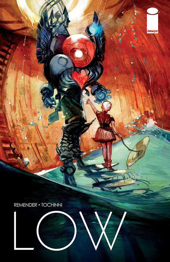
Major Issues: Low #1

LowCover

In Major Issues, we look at one newly-released comic book each week. Now updated Mondays.

Gardner Mounce

Low #1
Written by Rick Remender
Art by Greg Tocchini
Published by Image Comics
Publication Date: 7/30/14

Louis C.K. has a great joke about telling his daughter that in millions of years, once she and everyone she knows is dead, the sun will explode and kill everyone on earth. There’s not much of a punchline other than the fact itself, and finding it funny might be the litmus test for whether or not you’d enjoy Rick Remender’s latest series Low, a story about humanity’s last ditch effort to escape an expanding sun by living in cities beneath the ocean surface. Remender–always the pessimist–says it’s a story about optimism. We’ll see.

Unlike Remender’s other currently-running series, Black Science, a no-holds-barred sci-fi story that is supposedly written without a plan, Low promises something more classic and structured. There’s a clearly defined ticking clock (the sun is expanding) and even some mustache-twirling bad guys. We meet Johl, his wife Stel, and their two children. They are descendants of the Caine family, a founding family of the underwater cities. In this issue, Johl and Stel take their two children out of the city for the first time and run into trouble with underwater savages.

Remender paces the first issue well, but flounders with the exposition. He mostly avoids his trademark pessimistic narration, and opts instead to stuff his characters with exposition-heavy dialogue. In the first scene, Johl and Stel have one very stilted post-coitus conversation about plot points. But thanks to artist Greg Tocchini’s ability to draw realistic body language, we pick up that the two are very much in love. They just don’t have a lot to talk about besides exposition.

As for the art, Tocchini creates a visual vocabulary out of Low’s underwater aesthetic, especially in his use of spheres and circles. Not only are some of the panels themselves circular, but so are many aspects of the city’s architecture, and much of the technology is spherically designed. The spheres suggest air bubbles rising from oxygen tanks, the glass bubble that encases the city, the sun and the earth, and serves to indicate how fragile spherical things are in general.

Even better is Tocchini’s way of suggesting the central conflict with the color palette. The two-page title page separates the world into burning red and absolute black–the polarizing forces of the burning sun above and the crushing ocean depths below.

Low-001-003-e1406846459126.jpg

Between these two extremes is where our characters live, in warm amber and deep jade–suggesting human warmth and the more habitable ocean depths, but also suggesting how sandwiched our protagonists are between destruction above and oblivion below.

image2-600x461.jpg

Like most of Remender’s comics, I’m more excited by the art than the writing. Even in a comic about earth’s inevitable destruction, Remender’s writing comes off as heavy-handed. However, as long as he keeps pairing himself with artists like Tocchini who can add nuance and layers of meaning, I’ll keep coming back for more.

Should You Get It?

You could probably wait until the trade paperback of the first story arc. If you’re new to Rick Remender, I’d skip this and check out his series Deadly Class. It’s the best thing he’s got going right now.

Gardner Mounce is a writer, speaker, listener, husband, wife, truck driver, detective, liar. When asked to describe himself in three words, Gardner Mounce says: humble, humble, God-sent. You can find him at gardnermounce.tumblr.com or email him at gmounce611@gmail.com