comic book review

Major Issues: Drifter #1

drifter-1-cvr.jpg

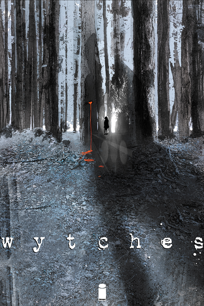
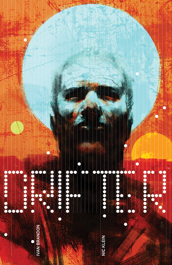
Written by Ivan Brandon
Art by Nic Klein
Published by Image Comics on 11/12/2014

In Major Issues, we look at one newly released comic book from the last week.

Gardner Mounce

On a recent podcast, the guys at Cracked discussed an idea called parallel thinking. It’s what happens when two completely unrelated creators simultaneously come up with a similar idea. It’s not that the two creators are spying on each other, it’s that both have their finger on the culture’s pulse and feel that it’s an appropriate time for a certain type of story.

All that to say, Image’s Drifter isn’t the only new release to open with a spacecraft crash landing on an alien planet. Boom!’s Deep State starts in an eerily similar way. It soon veers off in a different direction, but both stories share the theme of living on a planet that soon defies your original understanding of it.

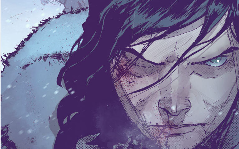
In Drifter, Abram Pollux crash lands on Ouro, an alien planet where everyone conveniently speaks his language. We begin with narration overlaying images of Pollux’s spacecraft hurtling through the atmosphere. The narration is written somewhere between the tone of Cormac McCarthy and Matthew McConaughey. You can imagine either delivering the opening lines: “Maybe it was shrapnel. A piece of all the things we’d left out there in the night.” Presumably, McConaughey would have then said, “All right all right all right,” whereas McCarthy would have let the protagonist get shot by a blind prophetic coon trapper. However, neither of those things happen so we can only conclude that writer Ivan Brandon is trying to go for something new here.

Following the crash landing, Pollux almost drowns, is almost eaten by an alien, and is subsequently shot. When he wakes up in a medic bay, he’s understandably in a lot of pain. However, he soon gets up and limps across town to get a drink (he’s grizzled like that) in the town’s bar, gets into a bar fight, and finally tracks a man through dangerous mountain terrain. The point is that Pollux is a bad ass (?).

At the end of the issue (no spoilers) Pollux discovers something that that upends his understanding of who he is and how long he’s been on Ouro. It’s not a unique or even necessary cliffhanger–I would have kept reading for the art and style of writing–but it raises some interesting questions nonetheless.

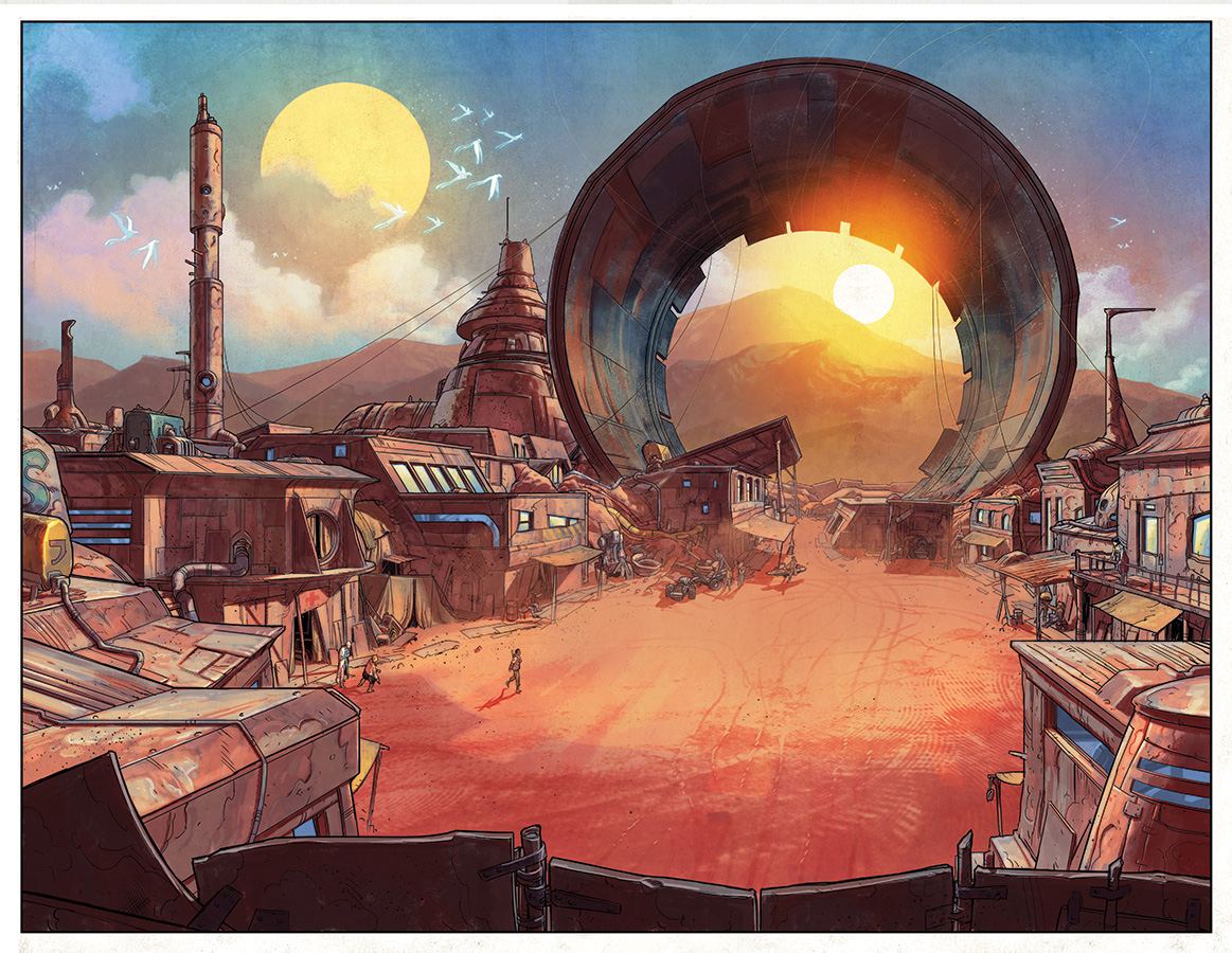
The art in this comic is out-of-control good. The images are crisp and beautiful. The world and the characters are defined and realistic. The world is submersive. Why take my word for it when you can drool over this spread of Ghost Town?

drifter1_Pg14-15.jpg

Should You Get It?

Do you have a crash-land-on-an-alien-planet-narrative-shaped-hole in your heart? If the idea of parallel thinking is true, then the teams behind Drifter and Deep State suspect that you might. Between the two, I’d hands-down choose Drifter.

Gardner Mounce is a writer, speaker, listener, husband, wife, truck driver, detective, liar. When asked to describe himself in three words, Gardner Mounce says: humble, humble, God-sent. You can find him at gardnermounce.tumblr.com or email him at gmounce611@gmail.com 

Major Issues: God Hates Astronauts #3

GodHatesAstronauts_03-1_1.png

Gardner Mounce

In Major Issues, we look at one newly released comic book from the last week. Updated Mondays.

God Hates Astronauts #3
Story, Art, and Colors by Ryan Browne
Published by Image Comics  11/5/2014

God Hates Astronauts is what you’d get if Adventure Time was written by the guy who made the videos at SickAnimation. It’s a ridiculous space opera about about a group of superheroes called the Power Persons Five who are hired by NASA to prevent redneck farmers from launching their rocket ships into space.

Browne manages to give this story cohesion by consistently introducing the weirdest elements imaginable. There’s King Tiger Eating a Cheeseburger, the despot of the Crab Nebula. He is, in fact, a tiger eating a chesseburger always. There’s the Southern ghost narrator in the cowboy hat who honestly just gets on my nerves. Sometimes it works, sometimes it doesn’t. But since Browne is doing the art and the words and everything, there’s really no one to tell him no.

The best visual element of this series has to be the sound effects, which Browne uses as another opportunity to tell a joke. When Dr. Professor suddenly wakes up in issue #3 from a bad dream, there’s a motion line leading from his pillow to his head and the sound effect “WAKE THE FUCK UP!” that follows. At other times, it seems Browne is subverting the sound effects trope at a more basic level. When characters point, there’s a sound effect for that (point!). When characters eat a burrito, there’s a sound effect for that, too (“burrito!”).

But, brevity being the soul of wit and all, these recurring jokes that were so funny in issue #1 and were starting to wear off in issue #2 are now plain boring in issue #3. Browne’s off-the-wall writing is now expected, and he raised the bar so high to begin with that there’s really nowhere else to go. It’s like a good SNL sketch turned into a lackluster movie. It’s an exercise in stretching a joke to its breaking point.

Should You Get It?

I would read the online comic first over at his website.

Gardner Mounce is a writer, speaker, listener, husband, wife, truck driver, detective, liar. When asked to describe himself in three words, Gardner Mounce says: humble, humble, God-sent. You can find him at gardnermounce.tumblr.com or email him at gmounce611@gmail.com 

Major Issues: Rasputin #1

comics-new-image-comics-1.jpg

In Major Issues, we look at one newly released comic book from the last week.

Gardner Mounce

Rasputin #1
Story by Alex Grecian
Art by Riley Rossmo
Colors by Ivan Plascencia
Letters by Thomas Mauer
Published by Image Comics 10/29/14

[SPOILERS AHEAD]

There are few historical figures as primed for a magic realism retelling than Grigori Rasputin. The man survived something like (let me check my research) seven thousand assassination attempts. In Rasputin, Alex Grecian suggests that the mad monk’s knack for avoiding the grave wasn’t luck, but magical abilities.

Issue #1 begins at a dinner party. Rasputin is offered a glass of wine which he’s certain is poisoned. In narration, Rasputin muses on the origins of his name and mortality. The art in this scene is dark and full of cramped panels with off-kilter compositions. Oh, and let’s not forget the fact that a ghost, which is presumably only detectable by Rasputin, is standing behind the mad monk’s chair the whole time. More on that in a second.

Off a shot of Rasputin toasting his hosts with the poisoned wine, we’re transported back to Rasputin’s childhood home in Siberia where he helps his mammoth father collect firewood. This scene, and the one following, is mostly devoid of dialogue or narration. There are panels that could be accused of being redundant and unnecessary, or meditative and brooding, depending on your take. Personally, I think it takes guts to allot two pages to silent wood collecting in a debut issue. It slows down the pace and allows the reader time to ruminate on Rasputin’s humble beginnings. Or maybe writer Alex Grecian just really likes stories about wood collecting.

Following this scene are two scenes that introduce Rasputin’s ability to not only heal wounds but to bring back the dead. In the latter of these scenes, Rasputin has the choice to revive a man-eating Siberian death bear or his abusive father. Sorry, dad, but this choice was too easy. The colors in these Siberia scenes are faded, low contrast blues and browns, presumably to reflect the hazy recollection of memories rather than a favorite Instagram filter.

Probably my favorite detail in the flashback portion of this issue is how the creative team chose to express the Rasputin clan’s illiteracy by using icons for items like “firewood” and “death” instead of written words. Ever since the “pizza dog” issue of Hawkeye, I’ve been dying for more “icon speak” in comics. Rasputin’s dying father uttering “[skull icon]” isn’t as cute as pizza dog, but beggars can’t be choosers.

Issue #1 wraps back at the dinner party where Rasputin calmly downs the glass of poisoned wine. By now it’s obvious that the ghost standing behind Rasputin is his dead father. Whether his ghost dad follows him around as a sort of revenge or as a demented guardian angel is not clear just yet. So far he’s just stood there with his hand on Rasputin’s shoulder, perhaps to show that Rasputin feels his overbearing influence even years after his death. Or maybe death has given his dad some much needed perspective about how much of a dick he was in life.

rasputin-1-featured.png

Should You Get It?

If you like slow-building historical magic realism fiction about occult religious figures with magic powers, then yes, probably you’d like this.

Gardner Mounce is a writer, speaker, listener, husband, wife, truck driver, detective, liar. When asked to describe himself in three words, Gardner Mounce says: humble, humble, God-sent. You can find him at gardnermounce.tumblr.com or email him at gmounce611@gmail.com 

Major Issues: Memetic #

comics-memetic-1.jpg

In Major Issues, we look at one newly released comic book from the last week. Updated Mondays.

Gardner Mounce

Memetic #1
Story by James Tynion IV
Art by Eryk Donovan
Published by Boom! Studios, 10/22/2014

Combining the cursed media trope of The Ring and the narrative structure of a zombie movie, James Tynion IV and Eryk Donovan’s Memetic imagines a meme that, twelve hours after it’s seen, induces eye-bleeding zombieism. (It just happens to be the meme at the top of this post, so you’re fucked if you’re reading this.) At first blush, this conceit sounds like a cheap way to tie an exhausted horror subgenre to something “relevant to millennials” but Tynion and Donovan pull it off and then some.

First of all, Tynion IV isn’t making a land grab for a millennial readership he knows nothing about. The meme, “Good Time Sloth,” is a perfect parody of everything that makes a good viral meme. And as the world of Memetic falls under the meme’s spell, the social media response is spot on. People start writing “PRAISE HIM” beneath the meme, which is something no one has thought to write on a Grumpy Cat meme for some reason.

Tynion IV just as convincingly establishes his characters. Aaron, the protagonist, is a social media savvy college student whose vested interest in the social media storm that surrounds the meme is thwarted by his color blindness. For some reason, people only feel the meme’s euphoric effects if they can see it in full color. But luckily for Aaron, this keeps him safe for the meme’s delayed zombie effects. Martin, an insufferable philosophy major, brags about how he was probably the first to see the meme when it hit Reddit. Tynion rewards his “I was there first” douchery by giving Martin the honor of being the first to suffer zombification.

Donovan’s art shows a complex range of color and paneling, but the standout feature is the compositions. There’s not a sour composition in this issue. Scenes and panels flow with perfect pacing and positioning, easily reflecting the story’s emotional beats.

I think it was David Mamet who said that anyone can write a good first act. James Tynion IV has knocked the first act of Memetic out of the park. He introduced the zombies in a unique way, but the question is how will Aaron’s fight against them in acts two and three be any different from all of the zombie stories we’ve seen before? If the final two issues are anywhere as good as issue one, we’ve got nothing to worry about.

Should You Get It?

Absolutely. I haven’t been this excited about a zombie-anything in a long time. All the stars.

Gardner Mounce is a writer, speaker, listener, husband, wife, truck driver, detective, liar. When asked to describe himself in three words, Gardner Mounce says: humble, humble, God-sent. You can find him at gardnermounce.tumblr.com or email him at gmounce611@gmail.com 

Major Issues: Wytches #1

wytches-cover-1-final-103254.jpeg

In Major Issues, we look at one newly released comic book from the last week. Updated Mondays.

Gardner Mounce

Wytches #1
Story by Scott Snyder
Art by Jock
Colors by Matt Hollingsworth
Edited by David Brothers
Published by Image Comics, 10/8/2014

Disclaimer: I missed my opportunity to write about Wytches the week it came out because I was on vacation. I’ve been waiting for this comic all year, though, so I’m going to break my own newly-released comic rule. You can berate me in the comments. I can take it. (Full disclosure: I can’t take it)

What Scott Snyder wants you to know right off the bat is that Wytches won’t have anything to do with the witches of popular lore. He cleverly shows this in the first two pages. On the first page is the definition for “witch,” and the second page shows that definition scratched out. His point: abandon all preconceived definitions here. That’s also probably why he spelled it “wytches,” though he could have just misspelled it. Jury’s still out on that.

Issue #1 focuses on a horror movie trope as old as time. The Rooks family, running from their dark past, moves into a new house in a new town, only for that past to outrun them. Our teenage female protagonist’s name is Sail (full name Sailor). It’s more likely an implication that she’s the “sail” of the metaphorical family ship that keeps it moving forward, but all I could think of was that cat video…

1324316240_cat_jumps_off_balcony_ledge.gif

The dad reads like a Jack Torrance for the 21st century. He’s a great father to his daughter, a great husband to his wife, a writer–though of comics rather than novels–and very good under pressure. He’s certainly the lynchpin for this family. A character this noble must have flaws, though, and by the end of issue one, Mr. Rook’s cracks begin to show. He has a short fuse, which is a little too close to the Jack Torrance mold for him to be his own unique character, but whatever. However, since the mother is in a wheelchair, could we conclude that the father’s short fuse put her there? Jury’s out on that, too, though that would be a wonderfully dark twist.

The part of their dark past that we do find out about in this first issue is that Sail (SAIL!) witnessed a bully get shoved through a tree hollow.

IMG_2427.jpg

Did I mention that this comic is creepy? Everyone believes that Sail killed the bully, thus why the family moved to a new town. Obviously, Sail is more than a little shaken up by all this.

One of the worst mistakes a horror writer can make is to play their story heavy handedly. The creepier the horror, the greater need for a humorous or light counterpoint. Snyder does this well via the fun-loving Mr. Rooks and a couple of well-planted details that give the story authenticity. For example, one of Sail’s new classmates warns her of their teacher’s knack of “dick brushing” students–what happens when someone passes behind you in a crowded room and “accidentally” brushes you with their dick. This is the perfect way to bring us out of the horror for a moment before Snyder thrusts us back in.

The art team’s efforts are sharp, layered, and studied. Jock lays the groundwork with effortlessly composed panels of razor sharp inks, while Hollingsworth uses a multimedia approach to his colors. In the girl-shoved-through-the-tree scene above Hollingsworth blends moody greens and bruised purples to emphasize the primal violence seen in Jock’s drawings. In the scene below, Hollingsworth matches nauseating yellows and greens to the visceral mood of the scene.

IMG_2422.jpg

Speaking of deer sneaking into your house and vomiting viscera on the carpet, Snyder manages to lay the groundwork for a theme that I’m partial to in horror movies: nature is evil and will intrude the shit out of our puny civilization. It’s epitomized by the woods, deer, and, of course, the wytches. As we soon see, the wytches in this title are closer to the monster in The Blair Witch Project than the double, double, toil and trouble witches of popular lore. But unlike Blair Witch, which derived its power from withholding what the monster looked like, Wytches reveals the monster by the end of issue #1. Though the monster is terrifying, it does seem like the wizard reveals himself too soon. In spite of this, issue #1 leaves us with more questions than answers, and that will certainly keep us reading.

Should You Get It?

Though Snyder employs nearly all the horror movie tropes in this first issue, he delivers a truly creepy, character-driven story that promises a new twist on an antiquated monster. This is a must-pull.

Gardner Mounce is a writer, speaker, listener, husband, wife, truck driver, detective, liar. When asked to describe himself in three words, Gardner Mounce says: humble, humble, God-sent. You can find him at gardnermounce.tumblr.com or email him at gmounce611@gmail.com 

Major Issues: Butterfly #1

buttercover.jpg

In Major Issues, we look at one newly-released comic book each week. Updated Mondays.

Gardner Mounce

Butterfly #1
Story by Arash Amel
Written by Marguerite Bennett
Art by Antonio Fuso
Published by Archaia 9/24/14

New artforms all fight the same uphill battle to be respected by the artistic community. Like movies and novels before them, comics have gradually transcended their “juvenile” origins to gain a modicum of respect. Critics, aggregator sites, and culture publications have even started using that thorny word, “literary,” when it comes to comics. But what is a “literary” comic? In a Google search for “literary comics” you’ll find the realists like Craig Thompson, Will Eisner, and Daniel Clowes, which is to be expected if the same folks compiling the literary canon are compiling the graphical one. But unlike novels, these lists of “literary comics” also allow for the more fantastic (Watchmen, Maus, Bone). In this regard, the comic literary canon has more in common with the cinema canon that generally includes aliens and killer sharks. I bring all this up because Archaia, the publisher of Butterfly, says its goal is to publish graphical literature. Whatever that means, I took it as a cue to judge Butterfly carefully.

Butterfly is the story of a secret agent (codename Butterfly) whose cover is blown after she’s blamed for a murder she didn’t commit. Writer Marguerite Bennett deliberately paces this first issue with tense scenes and violent action bookended by flashbacks. It’s a complex introductory issue, but with just three issues to go, it needed to hit the ground running.

The writing is lyrical yet terse, with a penchant for the poetical. Take one of the opening pages in which Butterfly recounts a memory of her father teaching her how to shoot. More than just a pretty page, we see Butterfly’s personality and worldview jump off the page. The careful, clean pacing reflects her highly analytical mind, and the language speaks to her intelligence and insightful nature.

Capture.PNG

The art, too, is astounding in its reflection of the narrator’s psyche. Harsh lines and black shadows enclose muted colors. This reflects how Butterfly bridles her world in strict self-imposed rules and conduct. When Butterfly is in control of the situation, pages are evenly laid out in six panels of equal sizes. Notice how this technique is used when Butterfly stalks a man to an elevator and kills him.

Butterfly_001_011-600x911.jpg

She is calm and in control. Elsewhere, when Butterfly is out of control, the panels vary in size and shape, to reflect the frenzy of the moment or the fractal nature of memory (couldn’t find an example of that online, so unfortunately you’ll have to go buy one, ya freeloaders).

The worse thing to be said about Butterfly is that at points its plot is too overtaken by its style, which results in confusing storytelling. To go any deeper would be to spoil a key part of the story, so I’ll just say that my hope is that the questions I have now will be answered in subsequent issues.

Should You Get It?

The creative team behind Butterfly achieves a rare unity of purpose that most comic teams can only dream of. Art and words work in tandem to construct a world grounded in its character. It tells a story, but it also creates a graphical language which transcends it. I don’t know if that makes it literary or not, but it does make it a must-read.

Gardner Mounce is a writer, speaker, listener, husband, wife, truck driver, detective, liar. When asked to describe himself in three words, Gardner Mounce says: humble, humble, God-sent. You can find him at gardnermounce.tumblr.com or email him at gmounce611@gmail.com 

Major Issues: Escape from Jesus Island #2

Screen Shot 2014-09-21 at 9.56.05 AM.png

In Major Issues, we look at one newly-released comic book each week. Updated Mondays.

Gardner Mounce

Escape from Jesus Island #2
Written by Shawn French
Art by Mortimer Glum
Letters by Peter Parker
Self-published
Released 9/17/14

Full disclosure: I had trouble picking a comic to review this week. All of the comics I bought at my local comic shop I had reviewed before or didn’t come out this past week. So, heart pounding, I scoured Comixology’s new releases for something that struck my interest. Finding nothing, I went at it from a different angle. I tried to find the most ridiculous thing possible. I think you see where this is going. Ladies and gentlemen, Escape from Jesus Island.

Escape from Jesus Island is about a corporation called ReGen that attempts to clone Jesus on a remote island by using the nails once used to crucify him on the cross. Many mistakes are made, and ReGen is left with a horde of mutants (“Christards”) whom they use in divinity-testing experiments. The Pope catches wind of Regen’s efforts to clone the King of Kings and sends a team to infiltrate the island to rescue him.

Obviously, the creative team behind EFJI has two goals with this project: maximum camp and maximum horror. It’s all kitsch and viscera, exploiting every horror movie trope, pushing every limit until it’s all a hilarious mess. It had me scanning the credits for some mention of Sam Raimi.

It’s irreverent and silly, but some of the humor rises above the camp with a nimble Vonnegutian edge. Issue two opens with, “In the beginning, God created earth, where animals lived in harmony with the natural world for millions of years. Then God created man, and that was the end of that.”

The art has a photorealistic quality that lends itself to twisted violence. A more representational style would have made this feel less Evil Dead and more Stick Wars. But the horror is over-the-top and pretty damn scary. Just check out the following image:

EFJInr2_4.png

Should You Get It?

You’ll love this if you’re the sort of person who enjoys over-the-top comics like Preacher or movies like Evil Dead and I Spit On Your Grave.

Gardner Mounce is a writer, speaker, listener, husband, wife, truck driver, detective, liar. When asked to describe himself in three words, Gardner Mounce says: humble, humble, God-sent. You can find him at gardnermounce.tumblr.com or email him at gmounce611@gmail.com 

Major Issues: Hawkeye #20 and Why It’s the Best Superhero Comic Around

Hawkeye_Vol_4_20_Textless.jpg

In Major Issues, we look at one newly-released comic book each week. Updated Mondays.

Gardner Mounce

Hawkeye #20
Written by Matt Fraction
Cover artist: David Aja
Art: Annie Wu
Published by Marvel, 8/18/14

My problem with most superhero stories is that superheroes are defined by their privilege rather than their problems. The first question we ask about a superhero is “What powers (privilege) does the hero have?” instead of “What problems do they face?” Superman has super speed and super strength. Spiderman can shoot webs. Wolverine has claws and can heal himself. In all of these cases, the power is more important than the problem the hero faces.

This is bad writing because we can’t emotionally relate to privilege. We can’t relate to a person who has super speed or strength or laser vision. We can relate to Rick in Casablanca because of his problem: he’s torn between the love of a woman and helping a Nazi resistance movement. Now, if we just threw in there that Rick also has the ability to fly, then we’d expect for his ability to fly to play a big role in the movie. If he can fly, then the chance for Rick to solve his problems in a relatable, human way is over. Now the movie is about how he’ll solve his problems in a superhuman way that we can’t emotionally relate with.

Hawkeye doesn’t completely avoid this problem. After all, we know Hawkeye for his power. He is the person who’s great with a bow and arrow. But writer Matt Fraction sets this iteration of Hawkeye on a human (rather than superhuman) scale. For example, the whole series kicks off not with a display of might, but with an injury that puts Clint Barton (aka Hawkeye) in the hospital. No matter how good Hawkeye is with a bow, he is but human.

Why is this better than a superhero comic? Because we can relate to it. Clint Barton is an Avenger, but a human one with really shitty “powers” compared to Thor and Iron Man and the others. His pride in his abilities causes him to fly too close to the sun, time and time again. It’s not his powers that keep us rooting for him, but his lack of powers. Unlike Superman, who can only be harmed by some ultra rare element, Hawkeye can be defeated by anything. Fraction doesn’t have to keep inventing bigger and badder super villains to compete with Hawkeye’s abilities. Because he’s human, Hawkeye can be defeated by gravity, or even his rent.

Not only does Hawkeye have relatively shitty “powers” but there’s not even just one Hawkeye. There are two: Clint Barton and Kate Bishop. They’re just human, after all, so why not share the responsibility of being a hero? This male-female counterpart dynamic could potentially blow the door right open for some sexist, rigid, gender role bullshit, but Matt Fraction makes both characters not only equally as talented, but allows both to have their own quirks, neuroses, senses of humor, and charms. Personally, I like Kate Bishop more. She’s a hell of a lot funnier.

What Fraction can be praised for more than anything else is that he’s made this comic about the characters rather than hokey cliffhangers or a single central conflict. There are overarching conflicts, but many issues are standalone stories, and oftentimes about completely innocuous things like what Clint Barton’s dog does when Barton’s out of the apartment (Fraction’s just skilled enough to make those issues the most endearing [seriously, pick up the dog issue, it’s amazing]).

Should You Get It?

If you start reading Hawkeye, you’ll be hooked. Not because it offers a glimpse of superheroes punching each other, but because Matt Fraction has written a couple of great characters dealing with relatable problems both big and small.

Gardner Mounce is a writer, speaker, listener, husband, wife, truck driver, detective, liar. When asked to describe himself in three words, Gardner Mounce says: humble, humble, God-sent. You can find him at gardnermounce.tumblr.com or email him at gmounce611@gmail.com 

Major Issues: The Kingdom – Rise of the Ape King

1723a58d0c5e661e776811a0dbe75a5c_large.jpg

Gardner Mounce

In Major Issues, we look at one newly-released comic book each week. Updated Mondays.

The Kingdom – Rise of the Ape King
Story and Art by Jason Bienvenu
Published by Kingdom Publishing

In the afterword to The Kingdom, writer-artist Jason Bienvenu states that his goal with this project was to create a story reminiscent of the 80s cartoons he grew up with. And though you won’t find fighting robots or cats with boobs in The Kingdom, you will find a lovably familiar good vs evil story with a knack for cheesy one-liners. So in that regard, Bienvenu succeeded.

The story is archetypal and familiar: Pale, the outcast hero, rises to power in the wilderness only to come back to save the kingdom–like Luke Skywalker, Simba, and David did before him. He wears the hero of Joseph Campbell’s monomyth thousandth face. In any case, the series’ raison d’etre isn’t its story, but its art.

Character design, in particular, may be Bienvenu’s special gift. Bienvenu communicates his characters’ essences through their designs. Trepidacious, naive Pale wears showy red armor that nonetheless doesn’t fully protect him; his white mohawk and hard features reveal a youthful determination. Pale’s father, the lovable oaf, hardly wears any armor to show that he’s cocky and unconcerned. The Boar-O, a giant [mega]bear, wears nothing but an eyepatch and a metal arm–exposed, vulnerable, but fully confident. Even without backstory or dialogue, these characters are three-dimensional.

With such attention to detail, it’s frustrating that Bienvenu feels the need to over-explain the comic through dialogue and narration. The first issue is the most guilty of this, and acknowledges a lack of confidence in Bienvenu to tell a visual story. However, as the story progresses, the narration takes more of a back seat. By issue two, Bienvenu makes bolder moves in page layout, sequencing, and framing. By issue three, his confidence is perceptible. And issues three and four show Bienvenu at his most confident. The narration is minimal, the dialogue enhances rather than hinders, and the art flies off the page. Take the following splash page, for example. Among other things, Bienvenu breaks the background environment into broken panels, like cracked glass, to reflect the sudden violence of the scene.

6f7d8ea2baa10ee04940db6f90b73b60.jpg

Speaking of environments–as a native Louisianian, Bienvenu understands how to communicate the heat and humidity of the jungle with muted greens, muddy browns, and a sun that emits waves of feverish heat. Conversely, his night scenes communicate quiet awe for a pre-electricity view of the stars. The cities of The Kingdom are designed with similar attention to detail. Each has its own style of architecture and mood. My only wish is that he would have made some of these environments splash pages for us to drool over.

Screen Shot 2014-09-07 at 9.54.33 AM.png

Though The Kingdom oftentimes runs through the motions of the hero myth, it never takes itself too seriously. Bienvenu set out to have fun, and he did. The story is full of wise-cracking corny stepdad jokes, but that’s sort of what makes it so fun. In any event, it puts on full display a new artistic voice who will no doubt helm exciting future projects.

Where to get it:

Comixology
Amazon

Gardner Mounce is a writer, speaker, listener, husband, wife, truck driver, detective, liar. When asked to describe himself in three words, Gardner Mounce says: humble, humble, God-sent. You can find him at gardnermounce.tumblr.com or email him at gmounce611@gmail.com 

Major Issues: Wayward #1

Wayward02A-585x900-web.jpg

In Major Issues, we look at one newly-released comic book each week. Updated Mondays.

Gardner Mounce

Wayward #1
Written by Jim Zub
Art by Steve Cummings
Colors by John Rauch and Jim Zub
Letters by Marshall Dillon
Published by Image Comics 8/27/14

My high school English teacher taught me that it’s bad form to begin an essay with a quote, and that’s why I’m saving it for sentence two. Someone once said that anyone can write a first act. It’s fun and easy to come up with a group of characters and establish a conflict; it’s in act two where things get tricky. Even so, a first act can be told poorly. Wayward’s problem is that it sets up its pieces so quickly that it doesn’t seem to enjoy its own premise.

Issue one falls into the trap of trying too quickly to get to the action. It assumes readers don’t have patience for the setup and are rolling their eyes until someone draws a sword. Protagonist Rori Lane, an Irish-Japanese high school student, lands in Japan to start a new life with her mom. For some reason, her mom doesn’t pick her up from the airport, which conveniently allows Rori to discover her new superpower–the ability to see her literal future path displayed for her in a red line (exactly like Donnie Darko’s ability to see his future path in a blue line). She catches up with her mom over dinner and explores Japan a little. Three men in an alleyway accost her. She’s saved by a ninja girl. They fight them off. The guys end up being turtle monsters, she discovers she can jump buildings for some reason, etc, etc.

This would be too much for one issue anyways, but writer Jim Zub dumps additional exposition on us in gobs of narration. Comics are a combination of words and pictures, but I’d argue that they’re a visual medium first. I hold them to Alfred Hitchcock’s standard that, like film, if they are played “silently” (without narration) the story should still work. It’s the cliche: show don’t tell. Narration should never do the work that the visual element could do. Most of the narration in Wayward could have been relayed to the reader visually, but oftentimes the narration just parrots what the comic is already showing. For instance, in one scene Rori struggles to take an afternoon nap, but is unable to do so due to jet lag. There are three frames. In frame one, Rori is lying down, staring at the ceiling. The narrator says, “I wonder if my brain will stop whirling long enough to take a nap.” The second frame is the same shot, to show that time has passed. The third frame shows Rori sitting up, indicating that, no, her brain won’t stop whirling long enough for her to take a nap. The reader understands this and needs no further indication, but Zub provides two additional layers of narration. First, Rori says, “Nope!” Second, the narrator says, “I guess it’s time to go exploring!”, which is an unnecessary line since the next panel shows Rori exploring. Zub commits this crime of over explaining constantly in issue one. The overall effect is that it reads like a rough draft, like Zub is still in the process of learning what his characters want and hasn’t yet found a way to tell the story in an interesting visual way.

Artist Steve Cummings and colorist John Rauch created this comic for a niche audience: the anime-ers. Skin is translucent. Hair is green or blue. Everyone’s dressed like they’re in attendance at Anime Expo. I’m not an anime or manga fan, so the art doesn’t feel like an homage to a Japanese style so much as it feels derivative of it. However, Cummings’s perspectives are noteworthy. Wide shots distort like wide angle lenses, giving the effect that the comic is filmed. It gives issue one a slick cinematic feel that definitely catches the eye. Now, if only Zub would trust him enough to take that camera eye and show us Japan and Rori Lane’s knotty relationship to her parents rather than tell us about it.

Should You Get It?

No. Unless manga is an obsession for you, and you’ve read all the manga, and you need anything that looks like manga or anime right now.

Gardner Mounce is a writer, speaker, listener, husband, wife, truck driver, detective, liar. When asked to describe himself in three words, Gardner Mounce says: humble, humble, God-sent. You can find him at gardnermounce.tumblr.com or email him at gmounce611@gmail.com